Revolution Display
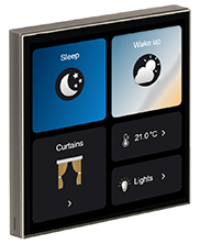
The Revolution Display’s touchscreen interface consists of up to 16 pages, each containing a 4x4 grid of widgets for information, control, and navigation.
Modes
The default configuration begins with a single  Primary Mode, containing one blank Home Page.
Modes are an optional method to group pages of controls for specific situations. A simple example might use:
-
Business Hours (primary) - Full HVAC/climate control, blinds, area/zone dimming sliders, etc.
-
After Hours - No HVAC, no blinds, basic ALL ON/OFF lighting controls for cleaning staff.
-
To add a new mode, click the
 New ⏷ dropdown arrow and select
  New Mode.
 -
To remove a mode, select it and click
 Delete (Del).
 -
To assign a new primary mode, right-click it and select
Set as Primary Mode. -
To rename a mode, select it and then left-click its name, press F2, or edit the Name field in the Mode Properties pane on the right.
| The Primary Mode cannot be deleted. |
Pages
Each UI supports a maximum of 16 pages. There are three page types:
-
 Home Page - This is the default start page for the current each mode. It is created automatically and cannot be deleted.
 -
 Standard Page - An optional page of additional widgets.
 -
 Standby Page - This page displays when the panel is in standby (max: 1 per mode).
-
Select the required mode (if applicable) and click the
New ⏷ button to add a Standard page, or click the dropdown arrow to select a Standby page. -
To remove a page, select it and click
Delete (Del). -
To rename a page, select it and then left-click its name, press F2, or edit the Name field in the Page Properties tab on the right.
-
To change the selected page’s background colour, open the Page Properties tab, select General > Background, then click the
 button to access the colour selection dialog.
Widgets
Widgets are predefined objects that include icons, text, and/or controls for various system components. You can add any arrangement of widgets in the available space on each page.
-
Select a page and open the Widget Gallery tab on the right.
-
Expand and collapse categories using the ⌃/⌄ controls next to each header.
-
To add a widget, simply click and drag it to a location on the page.
-
To remove a widget, select it and click the ❌ button.
-
To configure a widget, select it and open the Widget Properties tab on the right.
You can find more information on widget types and properties on the Widgets page.