UI Components
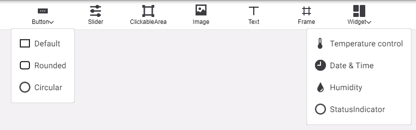
Click any component or widget on the top bar to add it to the page, then drag and arrange them as desired.
Select a component to view its Properties on the right:
-
Properties > Appearance includes size, appearance, and formatting options.
-
In Properties > Behaviour, click the + and - symbols to add and remove functions for interactive components.
Copying and Pasting Components
Right-click a component to Copy, Bring front/Send back (display over/under other overlapping components), or Delete.
After a component is copied, right-click anywhere on the page (or another page) and select Paste to add a duplicate.
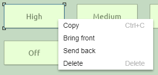
You can also select a component and use keyboard shortcuts:
-
Ctrl+C / Ctrl+V to copy/paste
-
Del / Delete to remove
Border Radius
The Border radius property rounds each corner of a UI component, drawing a quarter-circle with a radius of X pixels from the adjacent sides.
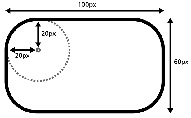
| The maximum radius is half the shortest side of the component, resulting in a semicircle; larger values do not have any further effect. |
H x W (px) |
50 x 100 |
50 x 100 |
50 x 100 |
50 x 50 |
|---|---|---|---|---|
Radius (px) |
0 |
10 |
25 |
25 |
Result |
|
|
|
|