UI Components

Click any component or widget on the top bar to add it to the page, then drag and arrange them as desired.
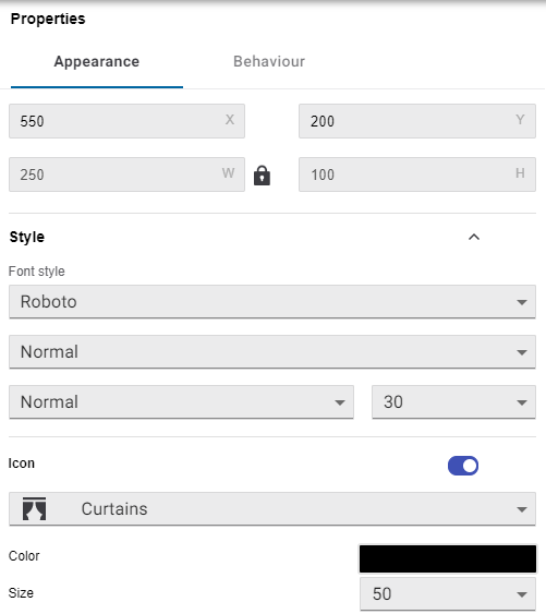
Select any component to view its Properties on the right.
Properties > Appearance includes size and formatting options.
In Properties > Behaviour, click the + and - symbols to add and remove functions for interactive components.

Component Types
Button
Buttons can perform a variety of functions:
-
Activate preset - Triggers a lighting preset scene.
-
Stop Fade - Pauses the current fade between presets.
-
Send Channel Level - Sends the selected channel level command to a single lighting channel.
-
Temperature Control - Increment (raise) or decrement (lower) the temperature setpoint.
-
Go to page - Opens the selected UI page.
-
Navigate to Home - Opens the Home page.
-
Previous Page / Next Page - Opens the previous/next page in the Pages list on the left.
-
Task Control - Start, stop, pause, or resume a task.
-
One Touch - Toggles between the selected On/Off preset scenes.
-
Enable Ramping - Holding the button ramps the light level towards the target preset.
-
Enable Program - Releasing the button while ramping saves the current light level as the new On preset.
-
-
Log out - Logs the current user out and returns to the Landing page.
-
Open schedule - Navigates to the Schedules page.
-
Open settings menu - Opens the Settings page.
Each button can perform up to two press functions and/or two release functions in sequence. For example, you can pair Activate preset or Task Control with Go to page to initiate the command and immediately load a new page with specific buttons or indicators related to that preset/task.
|
Previous/Next Page follows the displayed order of the Pages list on the left. To adjust the navigation order, drag each page up or down the list to the required position. This is not related to the page number, which acts as a target ID for the Go to page function and DyNet Page Flip command. |
You can also use functionless buttons as a static design element to display text with a custom background and border color.
Slider
The Slider displays and controls the channel level for a specific area/channel.
Enable Tunable White or RGB control for compatible fixtures by toggling Properties > Appearance > Slider Type.
ClickableArea
This is an invisible rectangular button that can be positioned over a custom background or Image.
You can position ClickableAreas over a floorplan background image for intuitive access to each room’s control page, or over your own button graphics to completely customize the UI to any aesthetic.
Image
Inserts a static JPEG or PNG graphic for branding/logo purposes, decoration, or as a custom control when placed under a ClickableArea.
Text
Inserts a configurable text element:
-
Static - Displays the contents of Properties > Appearance > Text label.
-
Area name - The name of the selected area.
-
Channel name - The name of the selected channel.
-
Active preset - The currently active preset scene in the selected area.
-
Channel level - The current level of the selected lighting channel.
-
User defined text - Displays the Active text if one of the selected presets is currently active. Otherwise, the Inactive text is shown.
-
Setpoint temperature - The temperature setpoint for the selected area.
-
Current temperature - The current actual temperature for the selected area.
-
Logged in user - Displays the username of the currently logged-in user, otherwise “guest”.
|
Only the Properties > Appearance > Text label is shown in the UI Creator, so ensure that dynamic text components are helpfully labelled. You can view the dynamically generated text in Preview, or after uploading the UI to the PDTS. |
Copying and Pasting Components
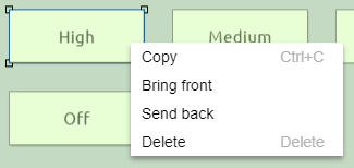
Right-click a component to Copy, Bring front/back (display over/under other overlapping components), or Delete it.

You can also select a component and use keyboard shortcuts - Ctrl+C/Ctrl+V to copy/paste and Del/Delete to remove it from the page.
Copied components can be pasted from one page to another.